This class subtitled "Form & Meaning" had us design work around one object for an entire semester. In my case, I chose a lighter. The assignments changed broadly, but the object had to remain consistent, and be at the forefront of every project.
The goal of this first assignment was to create a photo grid that highlighted the formal aspects of our object while also creating a visually interesting composition of images.
I primarily used photoshop and InDesign for this project and explored different ways of highlighting texture, light, form, heat, and color. To achieve a uniform grid I kept color to a minimum and broke up the images that were in color to balance the composition.
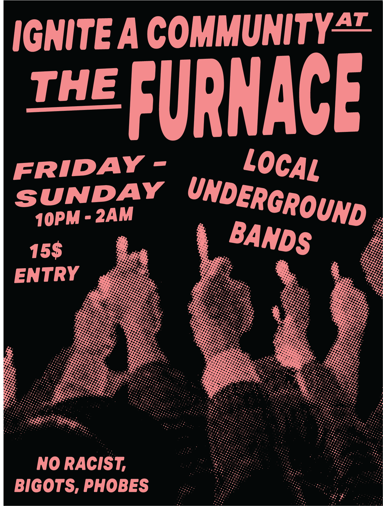
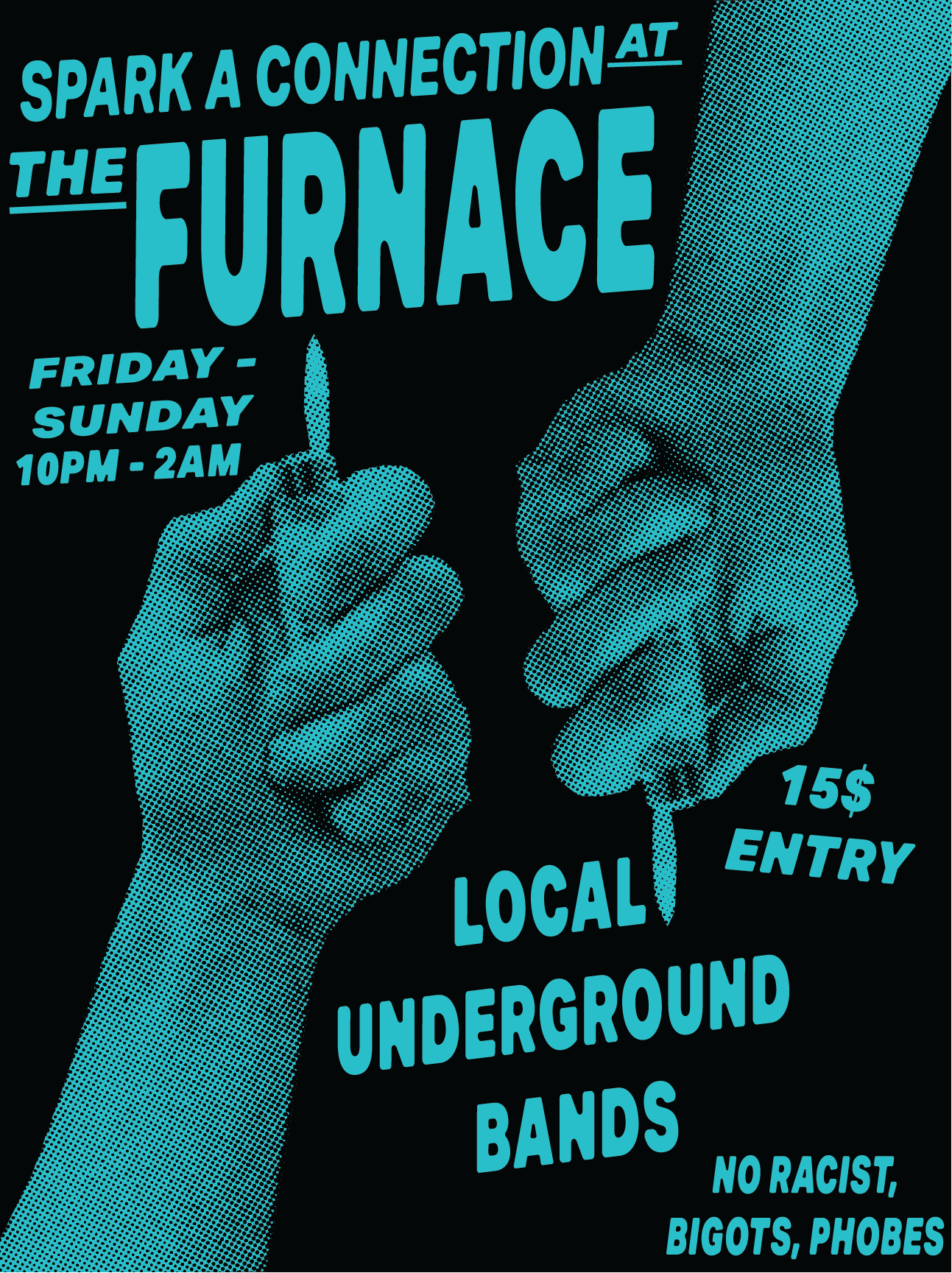
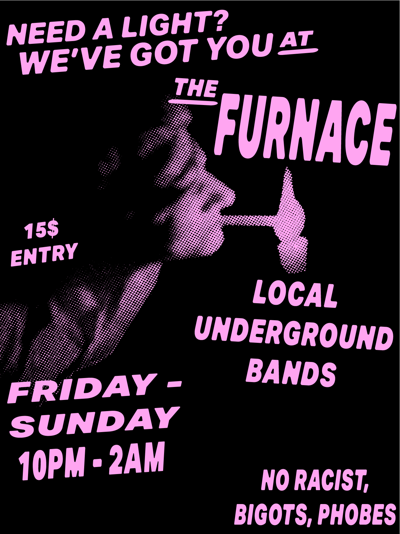
The goal of this second assignment was to create a cohesive poster series that incorporated connotation and/or metaphor to convey a message or theme. We were limited to one typeface.
I used Photoshop and Illustrator for this project. My main goal going into this assignment was to get creative with my compositions and mesh the photo elements and type cohesively. I decided to create a fictional concert venue to center my posters around because I wanted to link lighters with a sense of community. I immediately thought of the punk scene because its DIY nature fits perfectly with the limitations of the project.
This Assignment was to make a set of 9 black and white icons that worked in a collective theme associated with your original object.
For this project, I primarily worked with Photoshop and InDesign. I had never worked with iconography before, so I decided to design everything on a grid to keep a sense of uniformity between the objects.
The goal of this last assignment was to create a 10-15 second animation incorporating your object. We were limited to either Arial or Helvetica Typefaces.
This was my first experience working in AfterEffects. For this assignment, I wanted to continue developing the fictional concert venue in my poster series. Exploring what their promotions would look like as a looping video.
